Leverage data visualisation to keep your stakeholders well-informed
In order to fully benefit from Data-Driven Decision Making (DDDM), you need to utilise the consolidation of data into information that you can act on – data visualisation. Data visualisation is the practice of depicting data in a manner that is easily deciphered for the audience. To succeed in data visualisation, you need to:
- Decide on which data to show
- Illustrate performance
- Design your dashboard
Deciding on which data to show – Bringing data to life
When you have high-quality data that is relevant for your objectives, you should aim to create a simple overview to monitor your progression. Now, why is this a good thing to include in your approach to data leadership?
A wise man once said, “I believe in god, everyone else bring data!”. Theism aside this statement does hold truth. Think about the way you make decisions. Think about how you persuade your stakeholders. Proper argumentation in the decision-making process is supported by relevant and reliable data.
Now, you may think that you want to monitor everything that goes on in order to be on top of your operations. That is not the case, you need to set up a structure that allows you to easily track progressions for your key metrics. In turn, those key metrics should enable you to identify underlying problems or opportunities by narrowing your analysis going forward. The abundance of reports, dashboard signals and graphs are common with our clients. But these artefacts are rarely read and do not serve to induce action, they merely serve to report and appease stakeholders – that often do not read them due to the excessive reporting.
So, choose what is “nice to have” and what is “need to have”. The difference here is that the “need to have” should largely be evident in your overview. But keep these to an absolute minimum. The “nice to have” data can be configured in ways, so they are easy to dig up, but does not disrupt your attention to what really matters.
Illustrate performance by monitoring – a catalyst for action
In our Business Technology Standard, we address the area of performance management as a way to employ data to constructively improve performance. Particularly supplier relationships benefit from proper performance management that can illustrate well-performing or under-performing metrics.
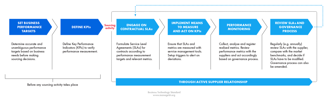
In IT Operations the ability to distinguish between 1st, 2nd and 3rd level support resolution time can support initiatives to bring down the overall resolution time. For example, an increased resolution time to an outsourced 2nd and 3rd level support function highlights a bottleneck that can be mitigated with proper IT Support process design.
Overall, the visualisation of performance should be in the interest of both suppliers and IT organization. It enables Service Level Agreement (SLA) monitoring to illustrate whether the agreements have been fulfilled or not. If the SLAs have visibly been fulfilled it incentivises suppliers to deliver the agreed metrics, which in turn benefits the IT organization. In contrast, if the SLAs have not been fulfilled it gives bargaining power to the IT organization to remedy the unfulfilled SLA.
Being able to track the accumulated performance against targets enables suppliers to rectify poor performance in time to still fulfil the SLAs in order to still reach the incentive targets. Hence, the performance monitoring process is a win-win situation if done properly for both suppliers and clients.
Design your dashboard – fit for purpose and audience
“There is magic in graphs – the profile of a curve reveals in a flash a whole situation” -Henry Hubbard, inventor of the periodic table
You want to design information in such a way that it can be interpreted in one second instead of five. In the world of big data, a key consideration is that 65% of the population are visual learners (Corporate Renaissance Group). For persuasive purposes and to help the reader, we should include visual aids to empower our message and the information we present.
The visual aids to illustrate data are vast, e.g.: charts, tables, traffic lights and rankings.
Consider what serves the purpose and utilise the aids to indicate priority. 96.8% of an audience attribute higher priority to larger boxes/visualizations (van Amelsvoort and Schilperoord). Thus, a difference in sizing can help draw attention to the most important data determined by you.
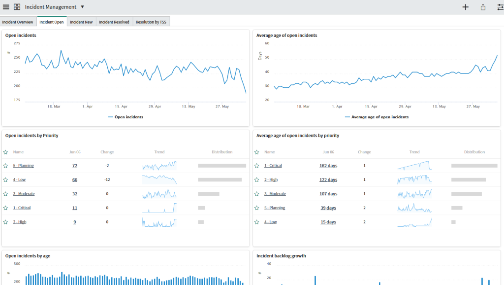
“Has our resolution time gone up or down over the past 6 months”?
Another important theme is “dynamic data”. Instead of having static data without any context, you want to contextualise your data, e.g. across time or benchmarked against other metrics. Development over time is an excellent example of a way to indicate the performance of a metric.
Data visualisation is an area fit for the principle of “less is more”. Be cautious about including an abundance of metrics that end up confusing the audience. In the end, you always want to have only the critical metrics evident at first with the option to deep dive into correlated metrics on a need-to-need basis.
References
van Amelsvoort, M. and Schilperoord, J. (2018). How number and size of text boxes in argument diagrams affect opinions. Learning and Instruction, 57, pp.57-70.
Corporate Renaissance Group (2017) How Data Visualization Leads to Better Decision Making. Online source.

Embracing AI for Future-Ready Portfolio Management – 5-Steps to consider today

Pepper brings the innovativeness of the ServiceNow platform to life